
Bored of salads? Struggling to eat enough veggies? SaladDecider can help bring health and flavor to your salad bowl!
This page contains a condensed process of my Springboard user experience project. If you’d like to download the entire PDF of my UX process to view more details and to read about it in chronological order, you may do so here. I will also be providing Google Drive links for individual parts of the project if they are too lengthy to fit in a section.
Defining a Problem
Nutrition is a topic that I find to be both interesting and important, so I decided to create a project that tackled a common pain point in many people’s diets: fruits and vegetables. According to a 2015 report from the CDC, only about 12 percent of American adults eat enough fruit, and less than 10 percent eat enough vegetables.

My solution? An app that transforms the salad-making process into a more pleasant, easier to understand, less stressful, and more fun experience! By dividing ingredients into sections (a base of greens, veggies and fruit, complete protein, and toppings/dressing) and selecting ingredients at random to encourage flavor experimentation, salads can be more appealing than ever!
To help me validate my idea, I surveyed people who were interested in increasing their vegetable/salad consumption, interviewed three survey takers who I felt embodied my potential users, and eventually performed a usability test for a prototype.
Read on to find out how SaladDecider came to be!
Prototype and Research Evaluation
Let’s admire the fruits of my labor and start from the end. This was the final result of my idea for a solution. You can try the interactive prototype here: https://invis.io/V4OXNP9GSYR

Since it was my first time putting together an InVision prototype, it was challenging to figure out how to test the features in a way that came across as natural and not too guided. Through usability testing, I learned that a task that may seem simple to a designer could be a user’s pain point, and sometimes you can receive unexpected results!
I was surprised that two of my three participants suggested a reduction in the degree of ingredient randomization; they said they would like an option to select from a handful of ingredients via a pop-up list when adding an ingredient. Perhaps this “roulette” feature could be the next addition!
Another shared experience of two participants was the action of adding a dressing, which initially confused them due to there being two add-ingredient buttons in the same section. I thought that labeling one as “Dressing” would clarify the differences between the buttons, but I will have to further explore the placement of these icons.
You can read more details of their responses here.
Style Guide
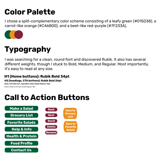
I created a style guide to define the visual identity of SaladDecider, though it is not present in the prototype. I found it to be quite challenging to decide on what combination of colors to pick, but I ended up selecting bold colors based on different vegetables.
Survey and Interviews
Aside from defining a problem, this was the formative step in my UX process. Before SaladDecider even had its official name, I created a survey with Google Forms to gather data:
Since this section contains several pages of content, I will be omitting some details and focusing on crucial points. Please feel free to view the full report here.
Overall, my survey’s results reflected my CDC-supported hypothesis regarding the lack of vegetables and fruits in the average American’s diet. Although it’s possible that people are meeting a portion of their vegetable intake via other means (hiding spinach in a smoothie, for instance), 22 out of 25 total respondents opined that they wanted to munch on more veggies in some capacity. Additionally, only three specified that they ate other veggie dishes.
Why did I focus on salads, though? Well, salads are easy to prepare, and many of the ingredients can be eaten raw, which minimizes prep time and effort. If someone can buy the ingredients, mix them together, and either eat it right then and there or pack it for a meal to be enjoyed later, then that’s a simple solution to the problem! Just about anyone can make a salad!
I selected three participants to interview based off of their shared attributes. All three were in their late twenties, occasionally or rarely ate salads, had a desire to improve their eating habits, kept a grocery list in their household, were willing to try new ingredients within their budget, and usually added some sort of protein to their salads.
Persona and Empathy Map
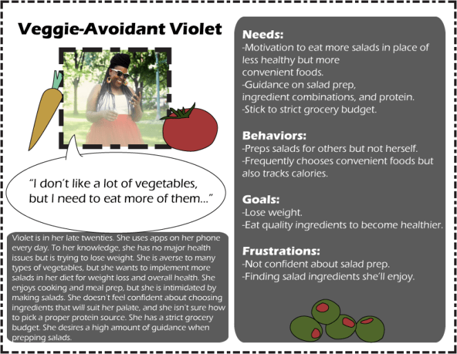
To empathize with users, it is helpful to create a persona who represents and summarizes the research data collected from similar people. Based on my interviewees’ answers, I decided to combine two of them into one persona while creating a separate one for the other. I was initially expecting all three to be comparable enough to justify creating only one persona, but it turns out that my third interviewee had radically different responses!
Furthermore, I created an empathy map for each persona to organize my users’ goals, thoughts, feelings, actions, and the pains and gains of using an app to solve their problem and reach their goal. Meet Simon and Violet!



Minimum Viable Product (MVP) and User Stories
I’m a fan of avoiding bloat whenever possible, and it turns out that all three prototype usability testers complimented SaladDecider on its minimalistic interface! From the beginning, I planned for SaladDecider to be a very lightweight app with only the necessary features (extras can always be added later, anyway). I focused on what the user would want from three key features: the ingredient randomizer, the grocery list, and the Help & Tips section.
| Feature | User Stories | Implementation |
| Ingredient randomizer | As a user, I want the app to generate an interesting combination of salad ingredients so that I can explore new culinary possibilities. | Include a “Generate” button that creates a random combination of salad ingredients. |
| As a user, I want to be able to have the app regenerate individually selected ingredients so that I can keep the ones I want without resetting the entire list. | Allow users to delete individual ingredient suggestions while keeping others on the list. | |
| As a user, I want to be able to select the quantity of ingredients so I can choose the amount I want in my salad. | Allow users to increase and decrease the quantity of ingredients. | |
| As a user, I want to be able to select, add, or remove an ingredient category so I can customize my salad the way I prefer. | Add separate categories for vegetables, toppings, dressings, and protein. | |
| As a user, I want to ensure that I’m not eating too many calories so that I don’t overeat. | Provide calorie counts with appropriate serving sizes (e.g., only 1 tbsp of dressing). | |
| As a user, I don’t want to get bored eating salads so that I can be motivated to keep eating them. | Include a variety of traditional and exotic vegetables, a plethora of toppings (nuts, seeds, cheese, etc.), and even other ingredients they may not have considered adding to a salad (hummus, tzatziki sauce, salsa, etc.). | |
| Grocery list | As a user, I want to save the app’s generated list so I can reference it when shopping. | Add a Grocery List section. |
| As a user, I want to save a salad I liked so I can remember what to buy and how to make it again. | Include a button that saves the salad to a Favorites section. | |
| Help & Tips section | As a user, I want to learn basic nutrition facts so I can understand the benefits of certain ingredients and be inspired to eat them. | Include interesting nutrition facts that grab users’ attention and get them motivated to consume wholesome foods. |
| As a user, I want to learn about complete proteins so I can ensure that I am meeting my protein requirements. | Offer a clear, concise definition of “complete protein” and have the Protein category only display complete proteins (incomplete proteins, like walnuts, will just be listed as toppings). | |
| As a user, I want to know how to make my salads as healthy as possible so that I’m benefiting from eating them. | Include a short paragraph that emphasizes serving sizes, the importance of dark leafy greens, aiming to make a salad colorful, and other useful tips. | |
| As a user, I want to make salads that taste good so that I’ll be motivated to keep eating them. | Give a few examples of simple, light homemade salad and salad dressing recipes. Suggest alternative ingredients they may not have thought to try (tzatziki sauce, hummus, salsa, etc). Assure them that it’s okay to add heavier toppings (nuts, cheese, etc.) as long as it’s in small amounts. | |
| As a user, I want guidance without receiving too much information at once so that I don’t get overwhelmed. | Organize into sections. Prioritize the most important information. Keep explanations concise. |
Heuristic Analysis
I compared one website and two apps that were similar to mine and picked three of the Nielsen Norman Group’s heuristic principles that were most relevant to the goals of my product: aesthetic and minimalist design, match between system and the real world, and help and documentation. My goal was to keep the app lightweight by including only the necessary features to solve the problem, use familiar terminology to avoid alienating users with nutrition jargon, and provide an optional section with helpful tips that users can read if they desire more information. Ultimately, the app should provide a simple interface that encourages users to focus on one easy task: eat more vegetables!
The following is a condensed version of my heuristic analysis. If you’d like a more in-depth look at my thoughts, you may read the full analysis here.
Competitor 1: Random Salad Ingredients Generator
- Simple, clean site design with a small handful of functions.
- Most labels were understandable, but a few had unclear meanings. For example, the definition of “Unique” was questionable. When I unchecked the box and generated another list, I got cheese in a can as well as bulgur. When I checked the box again, I got rucola, which seems to be a unique ingredient by most people’s standards.
- About Us and Contact Us were the only sources of help or documentation I could find, but the site’s feature is so basic that it doesn’t need much explanation.
Competitor 2: Salad Recipes: Healthy Foods with Nutrition & Tips
- I felt overwhelmed by the amount of content in both the main menu and the hamburger menu. It was as if the information was competing with itself.
- There were some unnecessary features, like the BMI calculator, that just added bloat.
- The wording confused me. What are “Taste Buds,” “Cook With” and “EduBank?” It turns out that “Taste Buds” refers to different flavors (sour, spicy, tangy, etc.), but I couldn’t decipher it without digging into the menus.
- The “Alert!” (upper right of screenshot) was jarring. Plus, when I tried to shake the device after adding a minimum of two ingredients, nothing happened.
- The actual help/documentation section, called Tips, presented another deluge of information and categories.
Competitor 3: Prepear – Meal Planner, Grocery List, & Recipes
- Prepear has a very pleasant, minimalist aesthetic. It welcomes the user with a large appealing image and asks them to sign in.
- The bottom bar has other buttons that lead to important sections, which allows the user to set meal plans, make a grocery list, and even check what meals friends have been eating.
- Uses plain, user-friendly language in its food categories, such as “Dinner,” “Sides,” “Salads,” and “Appetizers.”
- If the user clicks on the question mark button on the top right of the app, they will be sent to Prepear’s help section within their website.
Links to applications:
https://www.getrandomthings.com/list-salad-ingredients.php
https://play.google.com/store/apps/details?id=com.ma.cc.salad
https://play.google.com/store/apps/details?id=com.prepear.android
Card Sort
The following is a slightly condensed version of my card sort. If you’d like a more in-depth look at my thoughts, you may read the full analysis here.
I held an online open card sort via Optimal Workshop with eight participants to perform a basic evaluation of a people’s level of agreement of information labeling and organization. I was pleased that participants generally sorted the cards quite accurately and selected some terminology that encouraged me to reevaluate my title choices.

There was a lot of agreement on how to categorize the content of the app’s main feature, the Salad Generator. However, participants’ frequent use of the word “maker” convinced me to use it in place of “generator.” I also renamed Help & Tips to Help & Info since “info” is a more generally applicable word, relates more to the word “help,” and fits more cleanly within a UI button.
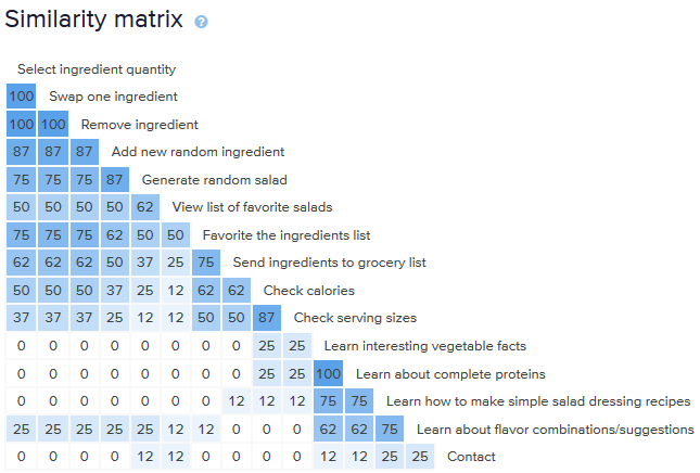
The main disagreement was on where “Contact” should go. I envisioned it as being within Help & Info, but about half of the participants labeled it as a separate category. Since all participants kept the number of categories to five or fewer, I kept Contact within Help & Tips. Fortunately, during usability testing, I found that participants swiftly located the contact form.
Sitemap and User Flows
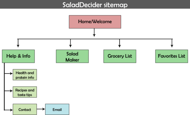
Due to the lightweight nature of my app, the individual number of pages are limited and only contain the necessary tools for users to generate random salad ingredients, favorite a list, add a set of ingredients to a grocery list, and read about topics such as complete proteins and basic recipes. I ended up expanding on the sitemap and filling in some of the blanks when I thought about user flows and what users might be trying to accomplish.
I had some difficulty determining where I should place the Help & Info contents. Originally, I was going to provide the information all in one section, but to avoid overloading users with a deluge of nutrition facts, I split the topics into separate categories.
SaladDecider’s user flow highlights three hypothetical users who want to complete different tasks. I chose these tasks based on a few key functions users may expect to perform in an app and imagined the steps they would follow in the process.

Sketches and Wireframes
Before the prototype was created, I imagined myself using the app and sketched images of what came to mind. It was a process that spawned several designs, most of which didn’t have the correct flow that I was attempting to achieve. This was the first one I sketched that I felt had a sense of direction:

Eventually, I drew one that I felt represented something that was fairly close to the layout of the upcoming prototype. My mentor suggested I break the salad-making stage down into additional categories that take more user needs and preferences into account (allergies, diet, etc.). At this point of the always-evolving, iterative UX process, it often becomes apparent that there are more gaps to be filled.


I wanted to clean up the rough sketches by converting them into digital wireframes, so I translated the design sketches into Adobe Illustrator. The appealing aspect of vector-based art is that it’s easy to resize as necessary without losing quality.
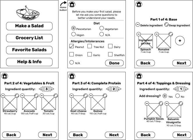

Although the Illustrator wireframes are close to the prototype versions, there were even more important alterations to be made at this stage. My mentor pointed out that the multi-step salad-making process could be combined into a single scrolling screen, which is present in the prototype. I also swapped the “Ingredient Quantity” buttons with one large, round Plus button to further simplify and clean up the layout.
Even after putting together what appeared to be “final” designs, I realized that there are almost always elements that need tiny tweaks until the design really appears complete. Iterate, iterate, iterate!